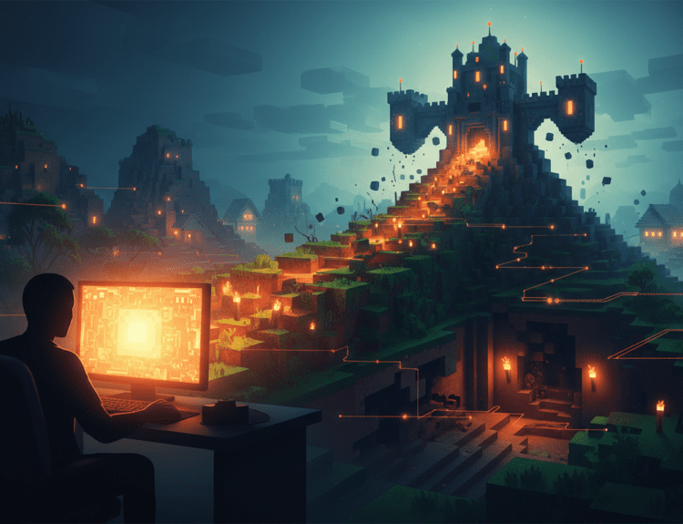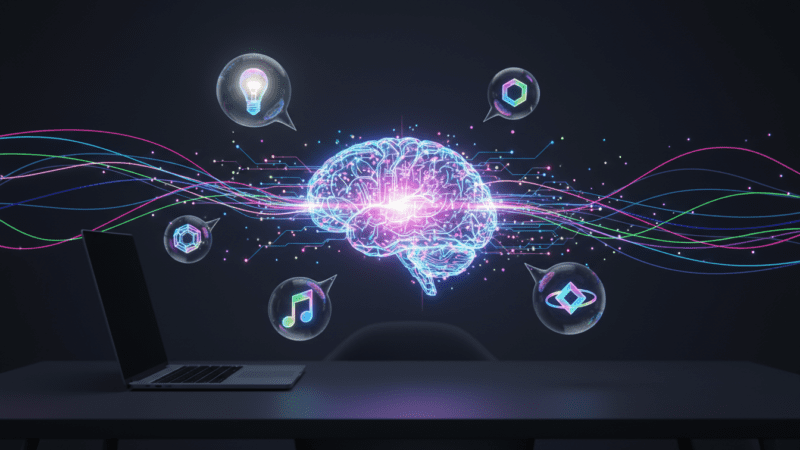
In the rapidly evolving digital world of 2026, a brand extends beyond a simple logo; it is a dynamic ecosystem of visuals that needs to be consistent across multiple platforms. For entrepreneurs and small business owners, hiring professional designers for social media icons or app graphics can be costly. This is where Generative AI enters the scene. By learning how to craft effective AI prompts for branding, you can take on the role of your own creative director, producing high-quality, unified assets within seconds.
However, the challenge isn’t just creating an image; it’s creating the right one—repeatedly. Consistency is the foundation of trust. If your Instagram icons look like 1920s Art Deco, while your LinkedIn banners are ultra-modern minimalism, your brand identity will break apart. This guide will lead you through the technical and creative details of prompting for brand consistency.
“Design is the silent ambassador of your brand. In the age of AI, the prompt is
the brush, but the strategy is the hand that guides it.”
— Sarah Jenkins, Senior Brand Strategist
The Foundation: Defining Your Visual Language
Before you type a single word into Midjourney, DALL-E, or Adobe Firefly, you must define
your brand’s “Visual DNA.” AI models are incredibly literal. If you don’t specify a style, they
will default to their most common training data, which often results in a generic “AI look.”
To achieve consistency, you need to establish a set of “Anchor Keywords.” These are terms
that will appear in almost every prompt you write for your brand. For example, if your brand is
a high-end organic skincare line, your anchor keywords might be: “Minimalist, soft pastel
palette, natural lighting, high-end editorial photography, clean lines.”
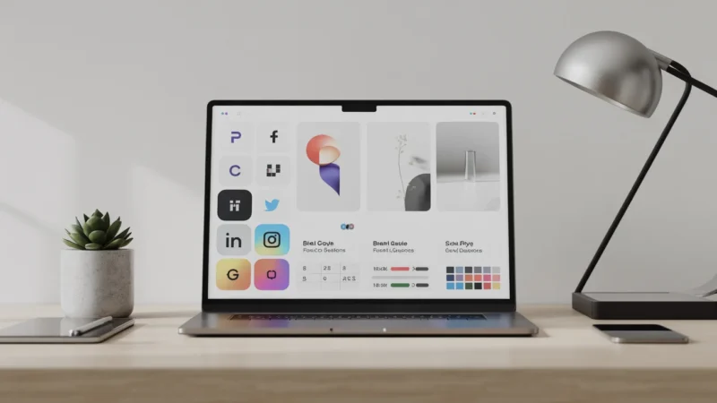
Creating a Prompt Style Guide
Just as traditional brands have a PDF style guide, your AI-driven brand needs a Prompt Style Guide. This helps ensure that whether you’re creating a logo or a Facebook ad, the output maintains a consistent look and feel like it belongs to the same family.
| Asset Type | Prompt Elements | Example Keyword |
|---|---|---|
| Logos | Vector, flat design, white background, geometric | “Minimalist vector logo” |
| Icons | Consistent stroke weight, isometric, simplified | “Line-art icon set” |
| Social Media | Depth of field, specific lighting, brand colors | “Soft cinematic lighting” |
Mastering Logo Generation with AI
Logos are the most difficult assets to get right with AI because they require extreme simplicity
and precision. Most AI models tend to over-complicate designs. To get a professional result,
you must use “negative prompting” or restrictive language.
The Formula for a Great Logo Prompt:
[Subject] + [Style] + [Technical Specs] + [Background]
Case Study: The Geometric Fox Logo
To demonstrate how a precise prompt translates into a professional brand mark, let’s
look at the result of our recommended formula. By being hyper-specific about what
to include—and what to exclude—we achieve a result that is ready for a modern tech
brand.
The Prompt Used: “A minimalist geometric fox head, flat vector design, bold lines, primary blue, and
white, isolated on a white background, no shading, no gradients.”
Analysis: Notice how the lack of gradients and shading makes the logo versatile for
print, embroidery, and small-scale digital use. The “primary blue” provides a strong,
trustworthy brand color that is easily replicable.
By specifying “flat vector” and “no shading,” you prevent the AI from adding 3D effects that
make a logo look dated or amateurish. For more on the technical side of vector graphics, you
can refer to resources like the AIGA Design Archives for inspiration on timeless logo
principles.
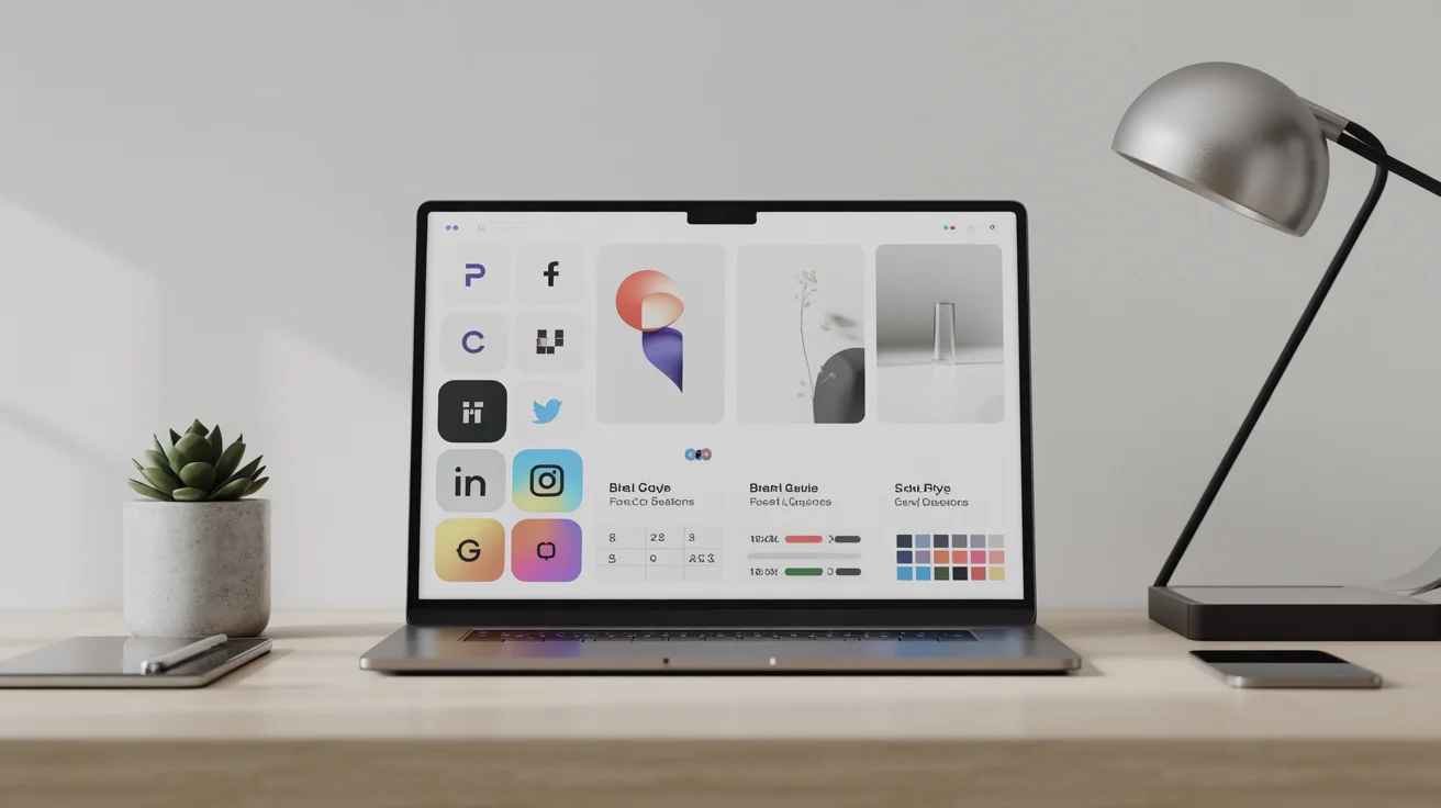
Generating Consistent Icon Sets
Icons are the “connective tissue” of your brand. They appear on your website, in your app,
and on your story highlights. The key to icons is uniformity. If one icon is filled and the next
is just an outline, the user experience suffers.
To ensure consistency, always prompt for a “set” rather than individual icons. This forces the
AI to apply the same stylistic rules to all elements in the frame. Once you have a set you like,
you can use “Image-to-Image” features to generate new icons based on the original style.
Pro Tip: The “Stroke Weight” Trick
In your prompts, specify the line thickness. Using terms like “2pt stroke weight” or
“thick bold outlines” helps the AI maintain a visual balance across different icons.
“Consistency in iconography isn’t just about aesthetics; it’s about cognitive
load. When icons look the same, users learn your interface faster.”
— Dr. Aris Thorne, UX Researcher
Social Media Assets: Maintaining the Vibe
Social media requires a higher volume of content. Here, the goal is to maintain a “mood”
rather than a specific shape. This is where your color palette and lighting keywords become
vital.
If your brand uses “Golden Hour” lighting for its photography, every AI-generated image for
Instagram should include the phrase “warm golden hour sunlight, soft shadows.” This
creates a subconscious link between different posts in a user’s feed.
Practical Workflow for Brand Consistency
- Seed Images: Use a “Seed” or a reference image in your prompts. Most modern AI tools allow you to upload a brand image and ask the AI to “follow this style.”
- Color Hex Codes: While AI isn’t perfect with hex codes yet, mentioning specific colors like “Emerald Green” or “Burnt Orange” is more effective than just “Green” or “Orange.”
- Iterative Refinement: Don’t settle for the first result. Use “Vary Region” tools to fix small details while keeping the overall brand look intact.
Frequently Asked Questions
- Can AI generate a logo that I can legally trademark?
Trademark laws regarding AI-generated content are still evolving. While you can use AI for inspiration and initial designs, it is highly recommended to have a human designer “vectorize” and finalize the design to ensure it is unique and meets legal requirements for registration. - Which AI tool is best for branding assets?
Midjourney is currently the leader for artistic “vibe” and high-end photography. Adobe Firefly is excellent for commercial use because it is trained on licensed content and integrates directly into Photoshop for easy editing. DALL-E 3 is the best for following complex, specific instructions. - How do I keep my brand colors exact in AI?
AI models often interpret colors loosely. The best workflow is to generate the image in the general color family, then use a tool like Photoshop or Canva to apply a “Color Overlay” or “LUT” (Look-Up Table) to bring the image exactly into your brand’s hex code specifications.
Conclusion: The Future of Brand Identity
Mastering AI prompts for branding is a superpower for the modern creator. It allows for rapid experimentation and the creation of a professional visual identity at a fraction of the traditional cost. However, remember that AI is a tool, not a replacement for brand strategy. Start with a clear vision, build your Prompt Style Guide, and use anchor keywords to ensure that every asset—from the smallest icon to the largest banner—tells the same story.
Recap: Define your Visual DNA, use consistent anchor keywords, prompt for sets to
ensure uniformity, and always refine your outputs to match your core brand values.
Happy prompting!